Problem
A fragmented city identity and bureaucratic digital barriers.
Solution
A digital-first brand and citizen portal built for everyday life.
Strategy as inspiration: Leipzig’s future plans embedded into the city’s identity
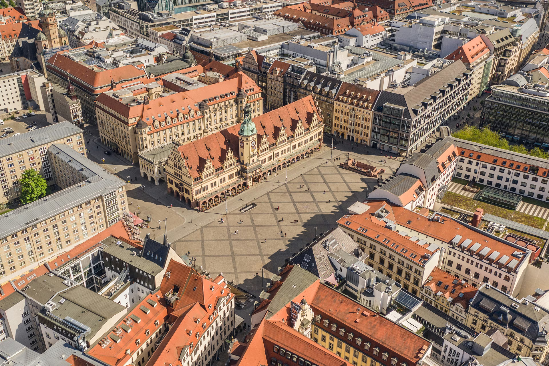
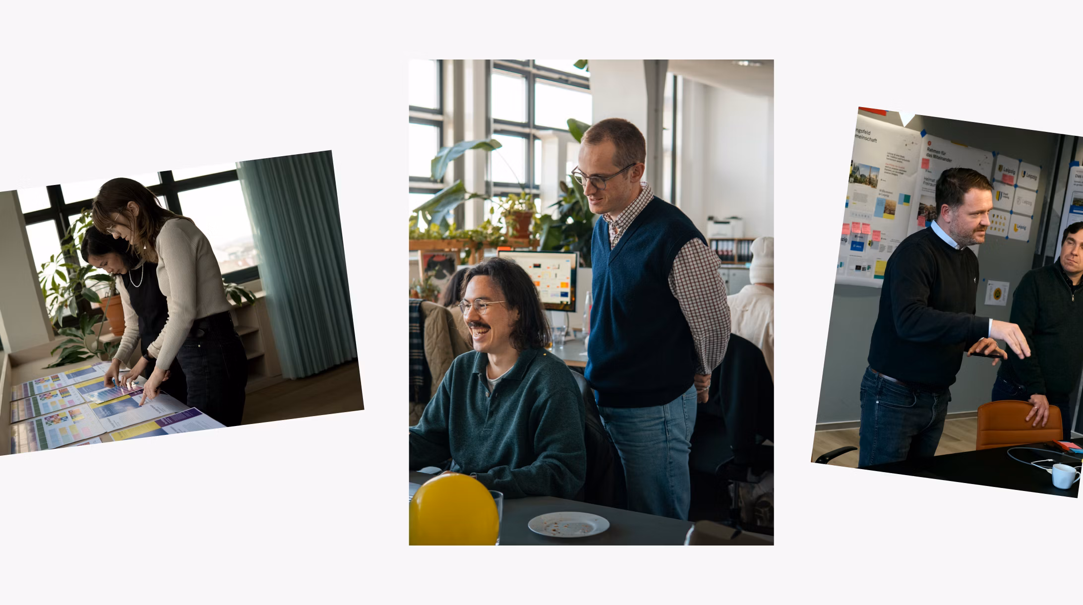
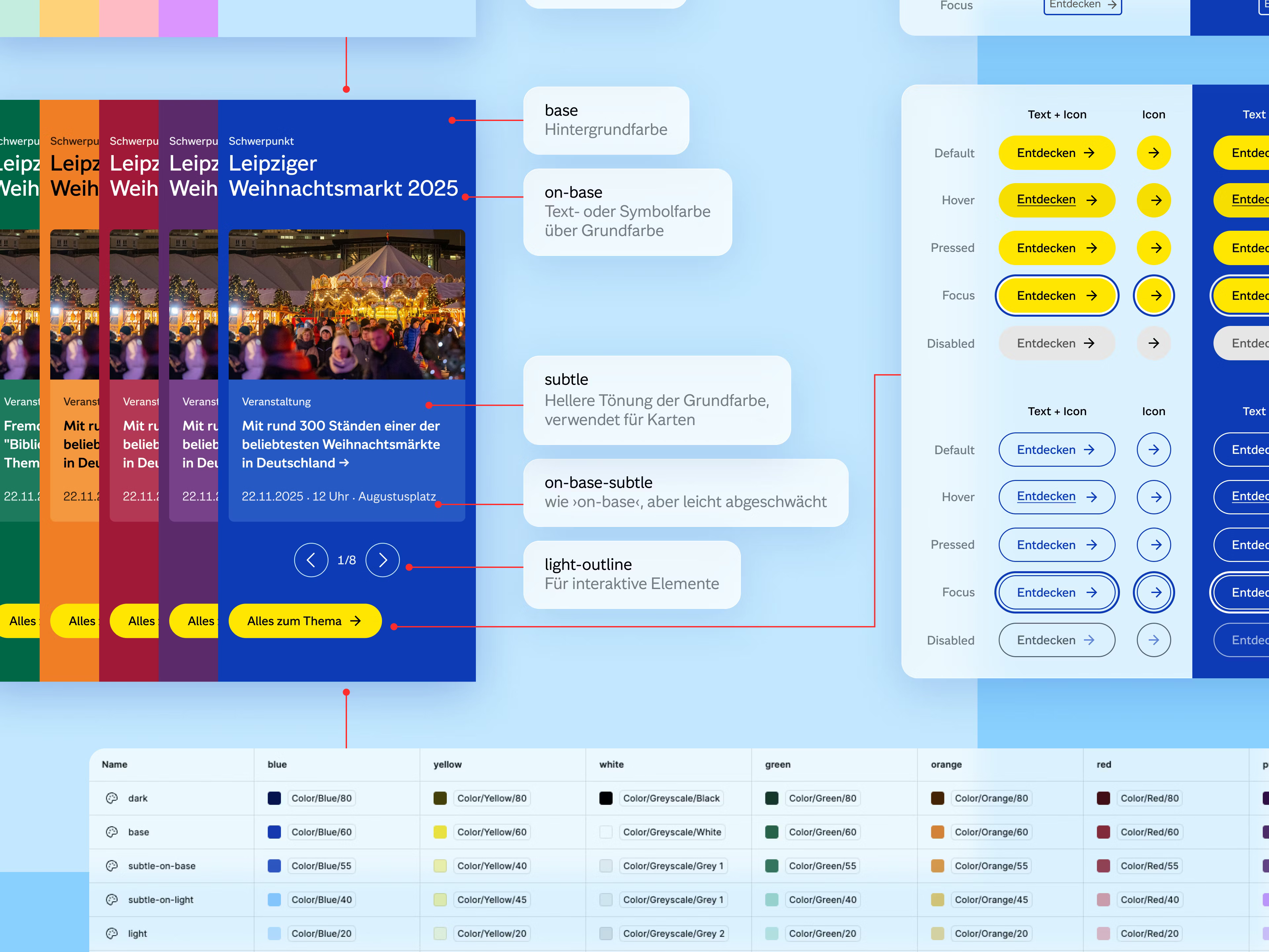
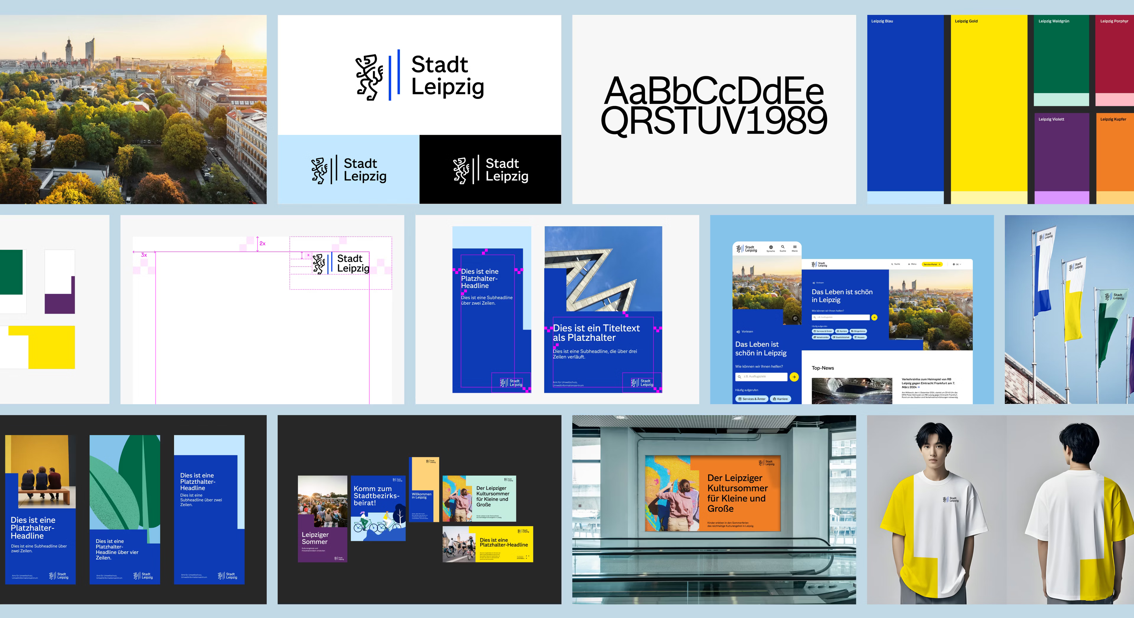
Leipzig is growing and intends to shape that growth responsibly. We translated this strategic vision into a digital-first corporate design: confident, public-minded, accessible, and scalable. The new brand mark connects heritage to the present by reinterpreting the emblem with the Meißner Lion and Landsberg pales through numerous iterations until a new expression emerged from the classic form. To support day-to-day efforts, we launched a brand portal with templates, guidelines, and assets, and anchored it with a training program. All of this was accomplished through a broad participation process that engaged many stakeholders — deliberately democratized, transparent, and paced to build consensus.
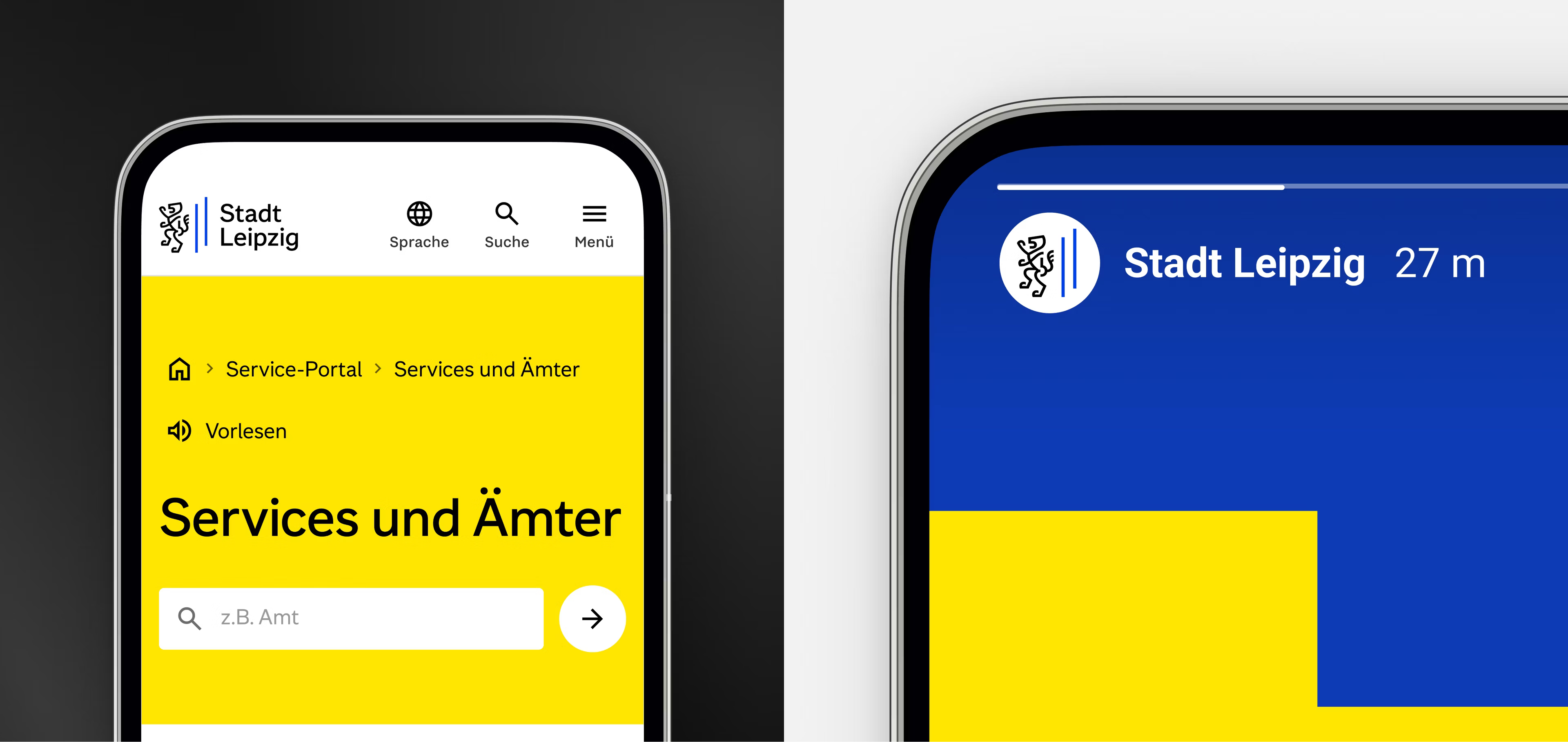
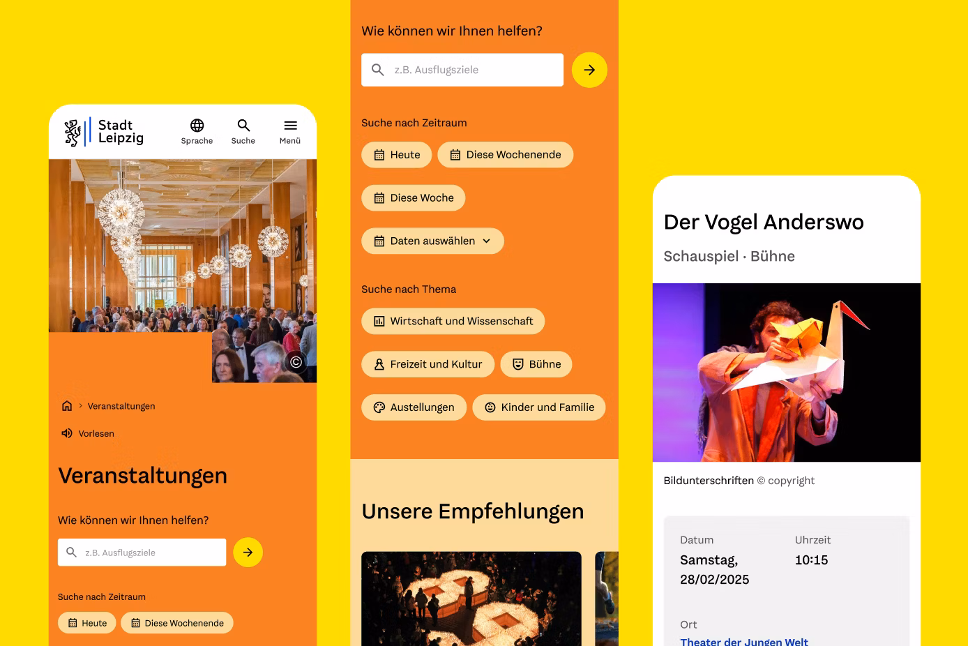
A new face in daily life: user-centric, accessible, understandable
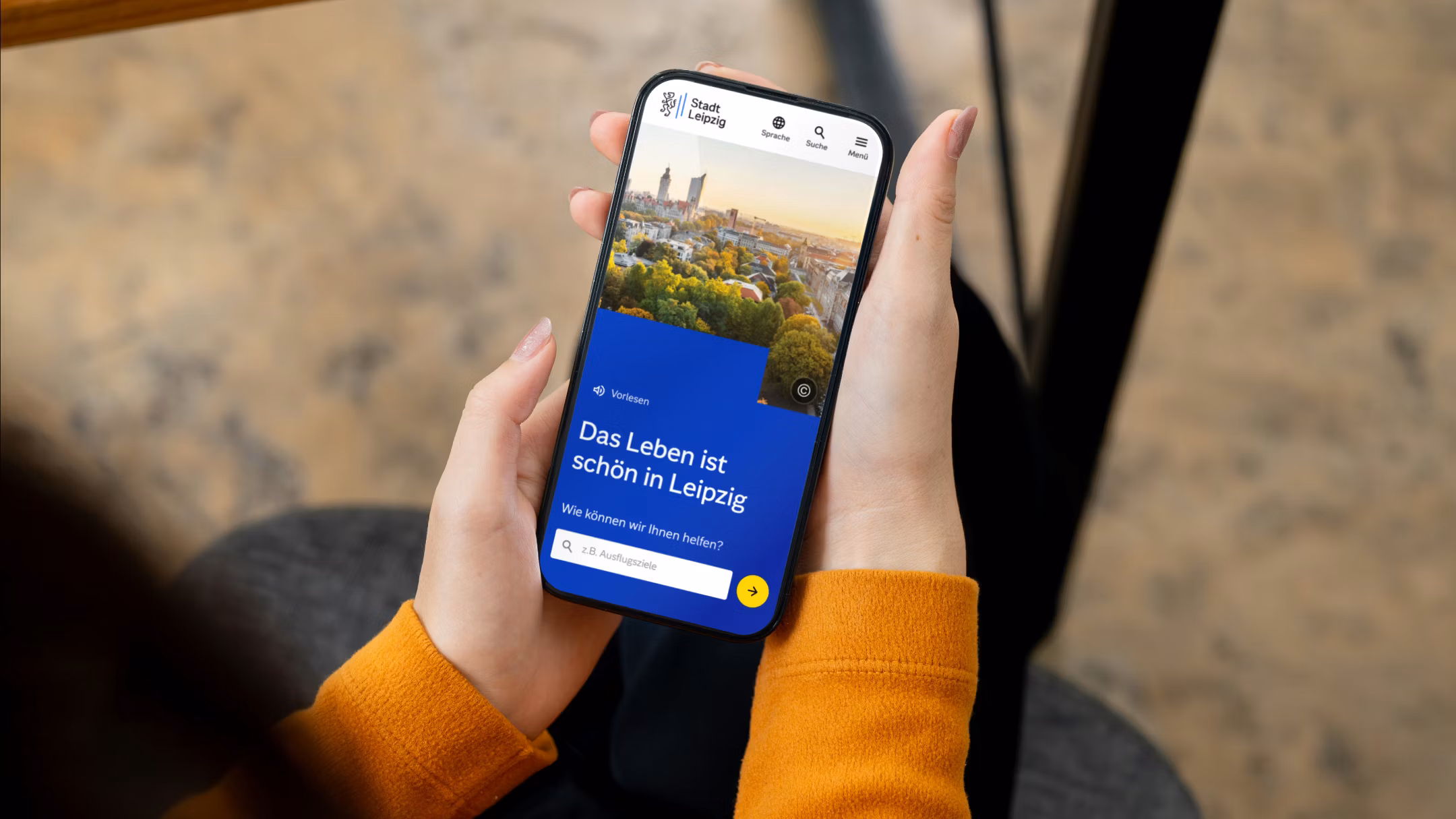
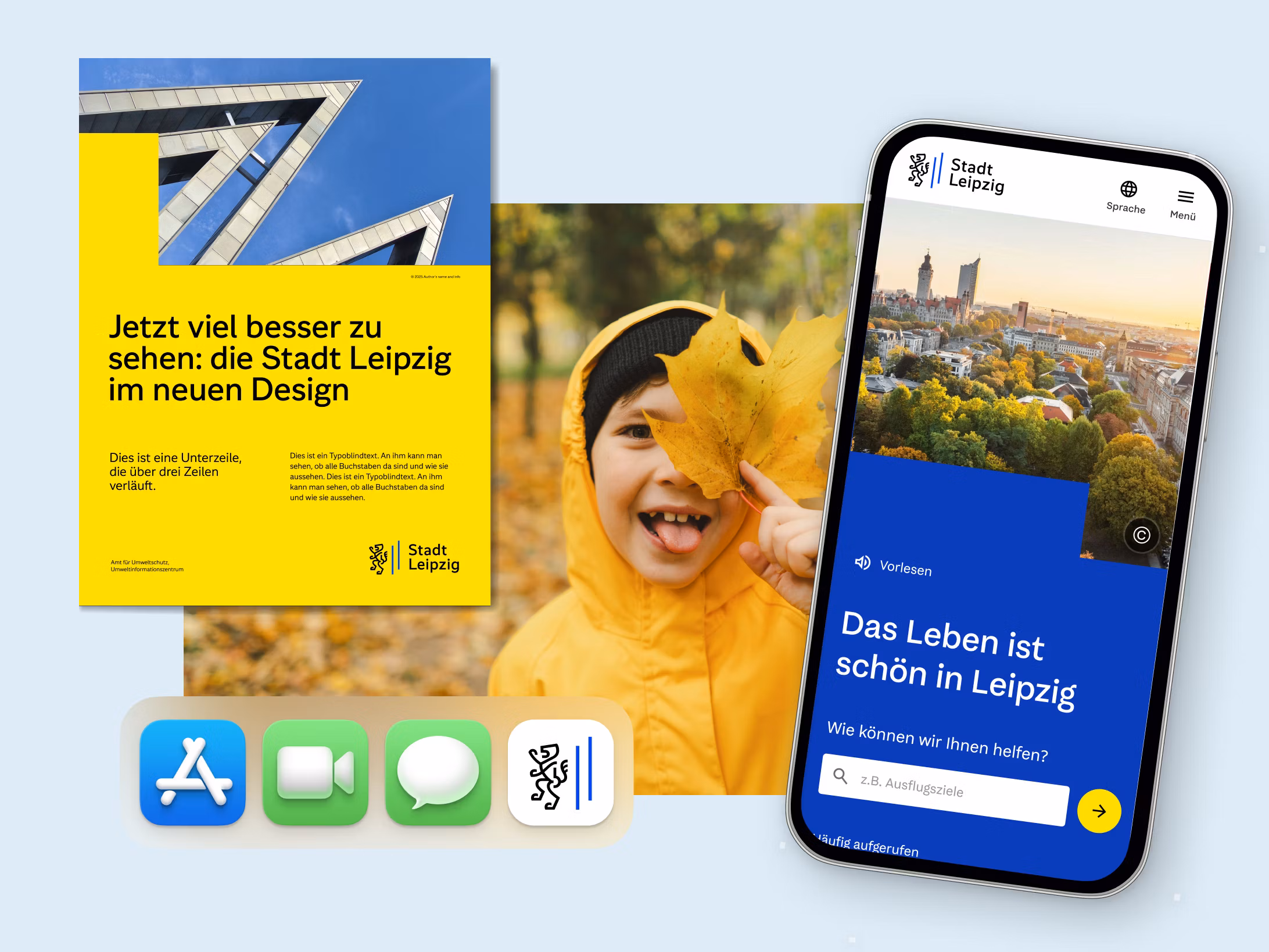
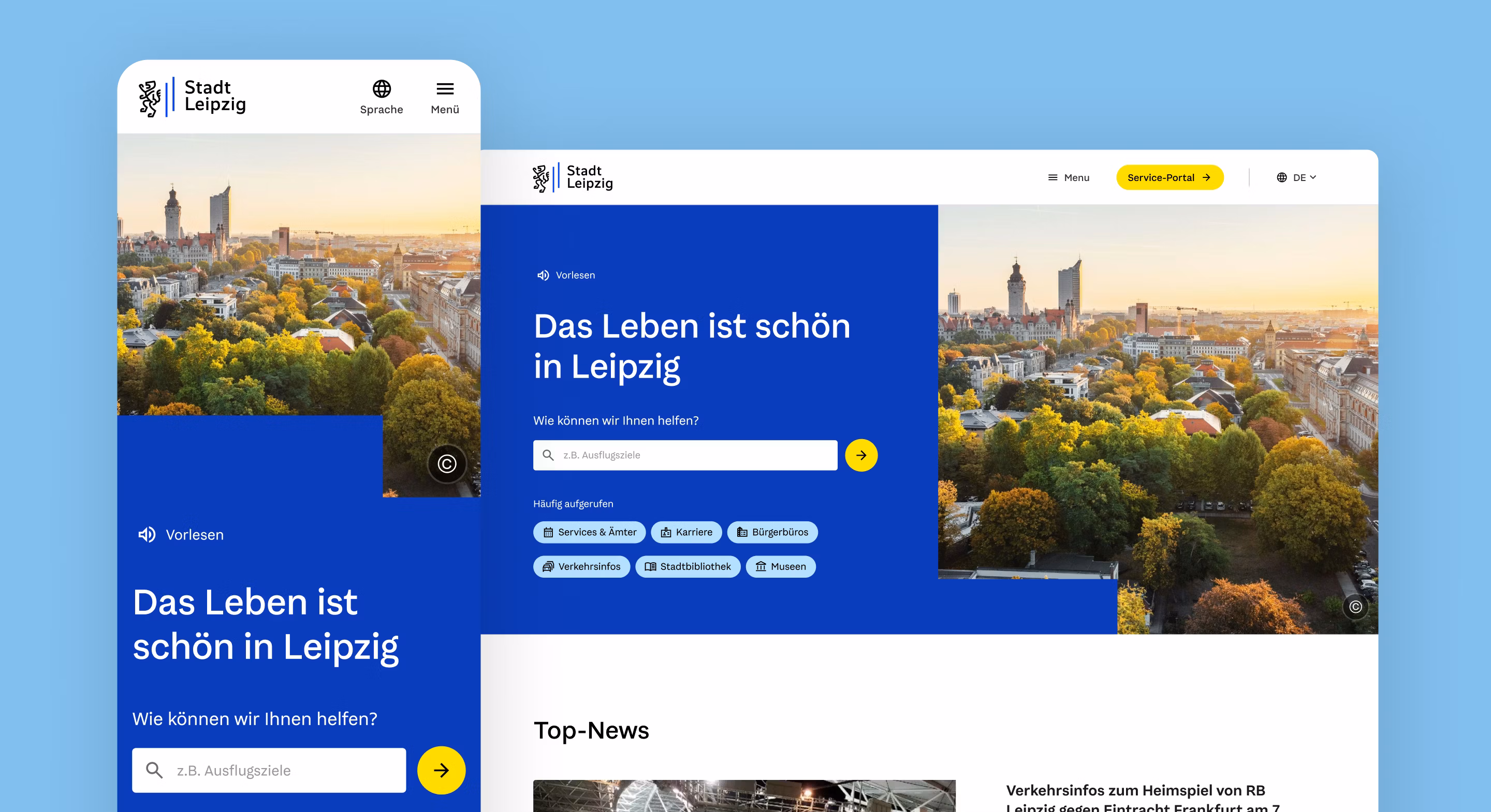
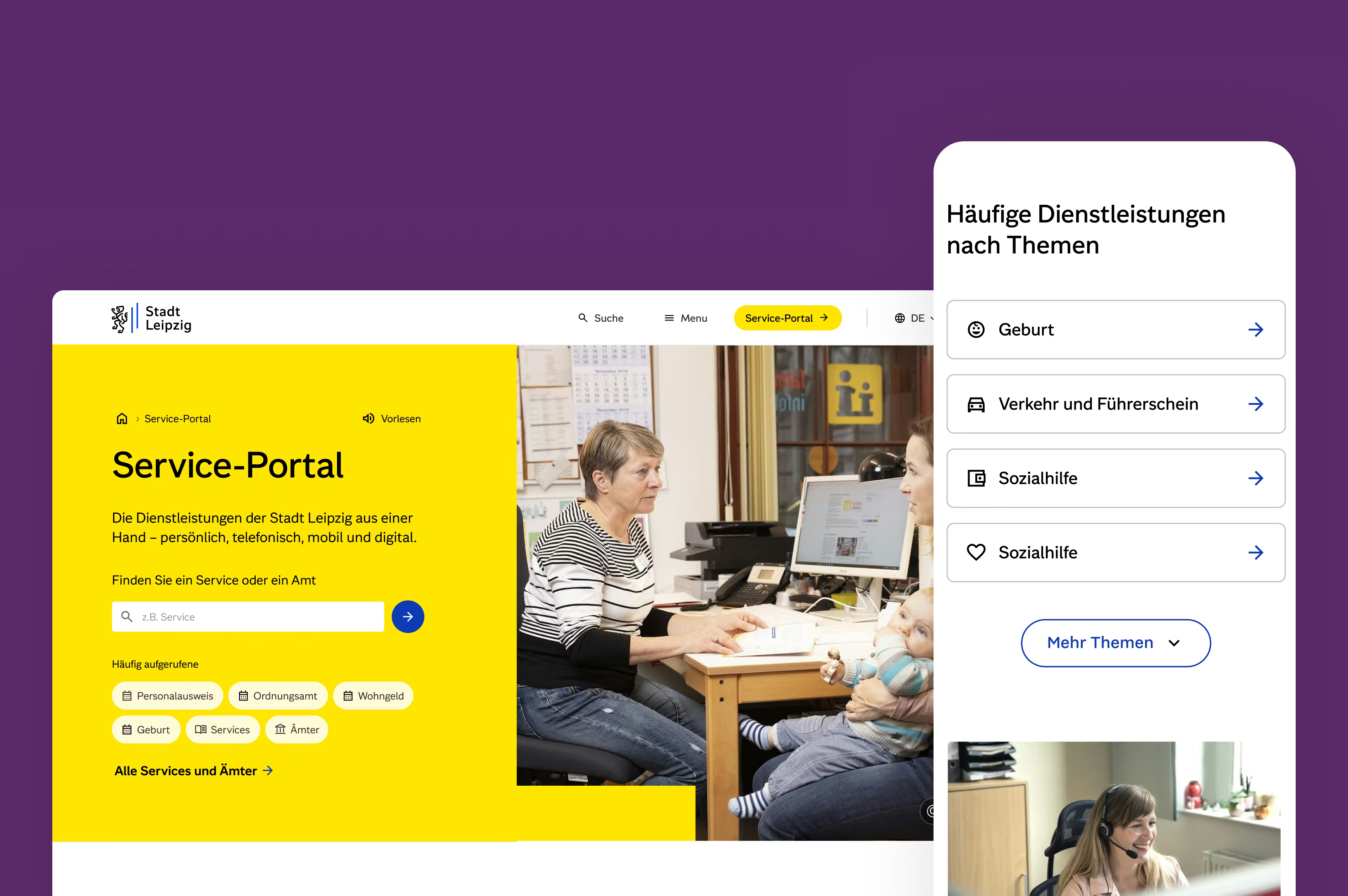
People think in topics, not in bureaucratic hierarchies. That is why the new Leipzig.de prioritizes thematic entry points and a powerful search tool instead of replicating complexity. Our research showed that perceptions of the city are shaped by how easily services can be accessed — an important cue for brand architecture and information design. The site serves dual roles: service portal and information/communication platform for topics, events, and news. Accessibility was a baseline, not an add-on, across typography, color, and interaction, both in print and online. Iterative prototyping and testing ensured language, navigation, and search truly resonate.
“The new corporate design presents Leipzig as a modern, open city. The administration becomes more visible, understandable, and accessible—from the exclusive typeface to Leipzig.de. With Edenspiekermann, we found a partner who connects strategy and everyday realities.”
In parallel with the brand identity: concept and design of Leipzig.de
We developed the corporate design and the citizen portal in parallel with the identity providing guardrails while the portal served as the real-world proving ground. The structure of Leipzig.de had grown organically over its lifetime and was highly complex (400+ subtopics/pages). Our focus: efficient, contextual search and thematic entry points rather than mere menu reduction. Delivery was a team effort with the existing development partner DMK E-Business (Chemnitz), translating the design into operational reality and scaling it as a component-based system. The city complemented the process with an expert jury from universities, museums, enterprises, and tourism to ensure reach and buy-in.
Broad applications, precise tools: exclusive typeface, templates, motion
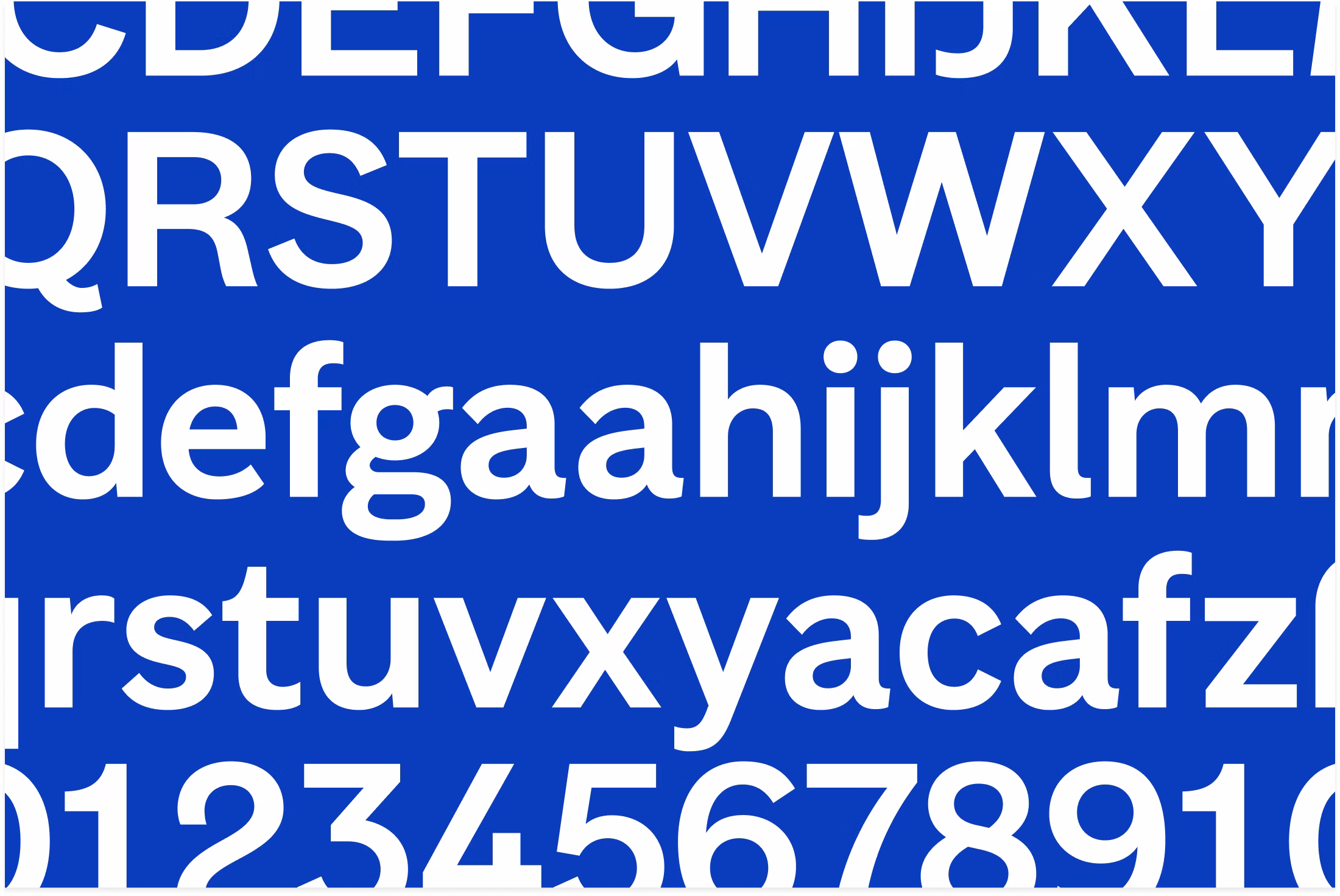
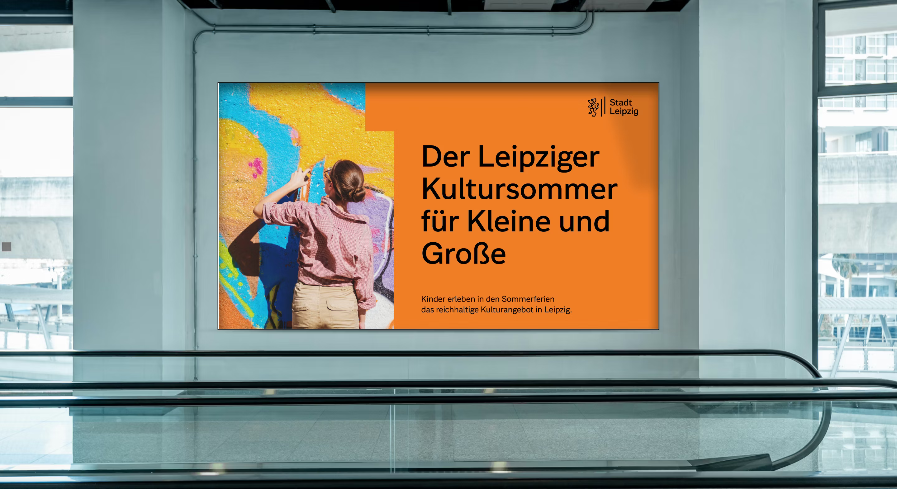
To ensure consistency for thousands of employees, we developed an exclusive typeface for the city together with Thomas Thiemich and Prof. Fred Smeijers from Type By. Beyond its value for the identity, a bespoke typeface was the most economical way for roughly 9,000 staff to secure the rights to a quality typeface as well as ensure long-term scalability. Templates, a UI kit, and clear typographic rules accelerate delivery and recognition across channels, and the logo illustration and master artwork ensure visual precision. Illustration and motion principles extend the brand into social, video, and web — documented in the brand portal and ready for municipal subsidiaries.
Together with Leipzig, we’re building a distinctive digital brand infrastructure: a flexible corporate design and a citizen portal that makes services easier to find—inclusive, scalable, and with respect for the lion.
Outcome
Leipzig now has a distinctive digital brand infrastructure that orients, simplifies, and connects—across administration and the public: a brand portal, exclusive typeface, UI kit, and clear governance ensure everyday quality; the citizen portal makes content and services faster, clearer, and accessible. The participatory process built acceptance—decisions were democratized, transparency and traceability embedded. With rollout and enablement underway, the system is reaching scale. The result: a future-ready city image that strengthens dialogue and makes everyday life noticeably easier for residents.